Starting a Home Project
Title: How to Start an Interior Design Project: A Guide to Timeless, Thoughtful Design
Starting an interior design project can feel exciting, inspiring—and sometimes a little overwhelming. Whether you're redesigning a single room or building your dream home from the ground up, approaching the process with intention makes all the difference. As a designer who values timeless elegance and the principles of slow design, I believe every space should evolve thoughtfully, with purpose and quality at its core.
If you're ready to begin your design journey, here’s how to start on the right foot:
1. Define Your Why
Before sourcing swatches or sketching floor plans, step back and ask: Why am I undertaking this project? Is it to create a more functional kitchen for your growing family? To design a sanctuary that feels calm and grounded? Clarity here shapes every decision moving forward—and ensures the final design truly reflects your lifestyle.
Tip: Write down three words that describe how you want the space to feel (e.g., welcoming, polished, serene). These will become your guiding compass.
2. Assess What You Have
A timeless design often honors the past. Take stock of what’s already in your home: heirlooms, vintage pieces, or quality furnishings that could be reimagined. Thoughtful editing—rather than starting from scratch—leads to spaces layered with meaning and history.
Slow Design Principle: Resist the urge to discard. Quality takes time and is worth preserving.
3. Establish a Realistic Budget and Timeline
Timeless design isn’t about chasing trends—it’s about choosing pieces that will last. That means prioritizing craftsmanship, materials, and finishes that elevate your home over time. Set a budget that allows room for investment in quality where it matters most.
Note: Slow design often means longer lead times, especially for custom or made-to-order pieces. Plan accordingly to avoid rushed decisions.
4. Create a Cohesive Vision
Mood boards are more than just pretty pictures—they’re a visual translation of your intentions. Pull inspiration from architecture, travel, art, or even fashion. Look for recurring colors, shapes, and textures that speak to your sensibility.
Classic Tip: Timeless interiors often draw from natural materials (stone, wood, linen), a neutral palette, and a balance of symmetry and proportion.
5. Function First, Then Beauty
A beautiful room that doesn’t work won’t stand the test of time. Start with how the space needs to function. Think about flow, natural light, storage, and how you truly live in the space. Once the foundation is right, layer in the aesthetics—beautiful textiles, classic millwork, antique finds.
Design wisdom: Good bones come first. Decorating is the final chapter, not the first.
6. Work with the Right Professionals
Whether you're hiring a designer, contractor, or tradesperson, choose collaborators who understand your vision and share your values around quality. Good communication and trust are essential—especially in a project that unfolds over time.
Pro Insight: I encourage clients to build a team early on, even before construction begins. Early decisions can avoid costly changes later.
7. Be Patient—and Present
Slow design means slowing down. Thoughtful decisions take time. Some of the best interiors are collected and completed over months or even years, not weekends. Don’t rush to “finish” a room. Let it grow with you.
Reminder: Timeless doesn’t mean static. It means enduring—something that continues to feel right, year after year.
Final Thoughts
Interior design isn’t just about creating a beautiful home—it’s about crafting a space that tells your story with grace, intention, and longevity. Starting with clarity, care, and craftsmanship sets the stage for a space you’ll love not just today, but for years to come.
If you're considering a project and want to design with purpose, I’d be honored to help bring your vision to life—slowly, beautifully, and with timeless detail.
White Paint Colors
Everything you need to know about selecting the right color and my go-to faves.
It is the design question every client asks, the decision that stumps the most: what paint color should I use? There are literally thousands of colors available - many of which are lovely and many more that look the same. (How many whites does this world need?!) Add in a dozen brands to choose from, a mind-boggling array of sheens... And while many designers and contractors will tell you otherwise, paint is a pain to change and it can be expensive to do so. Better to get it right the first time.
We'll share a little secret with you: designers use the same handful of colors over and over again. We know what works and rarely deviate. We not only want to get it right the first time, we want to get it right every time, because wall color is so important.
NEUTRALS RULE
Think of your walls like the canvas for everything else in your room. Neutrals don't go out of style or beg to be changed with the season. Regardless of whether you love brights, deep hues or anything in between, choosing the right neutral will provide your color palate with a strong foundation, allowing your furnishings, window coverings and architectural details to really pop.
OUR FAVORITES
Before you judge: the colors above look nothing like they do in real life, so we're doubtful you'll fall immediately in love with them like we know you would if you saw them in person. Ugh. We beg you to head to your local Benjamin Moore retailer and see their beauty in person... they're worth it.
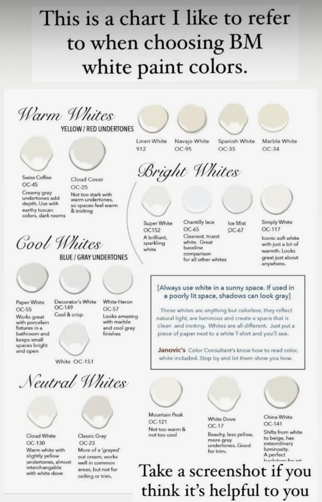
Our go-to color for trim is Benjamin Moore's Simply White, OC-24. It's not too cool, not too warm... it's simply white. And for a soft, creamy, "I play well with others" wall color, we use Benjamin Moore's Wind's Breath, OC-117. It's not too cool or warm. It doesn't push yellow or gray (as many neutrals do!), but it looks beautiful with either. It's the perfect neutral.
The combination is admittedly light, which we love, because it creates an airy foundation... to which you can add everything from bright hues to deep tones, depending on your style or mood. There is enough contrast from trim to wall, but not so much that all you see is woodwork. We've used it countless times because it works.
Simply White, OC-117, Benjamin Moore
Winds Breath, OC-24, Benjamin Moore
CHOOSING THE RIGHT COLORS
If you don't care for the above combo, here's how to select your own:
Look for inspiration. There are many resources (Instagram and Pinterest are our faves) where you can find photos with paint colors listed. Select your top three and look for the common thread - are they all cool? All creamy? Somewhere in between?
Look at your existing furnishings. If you're in love with gray walls, but have all gold-yellow-cream upholstered furniture, it may be wise to compromise with your paint color. (Mixing neutrals is very "in" but tough to do well.) Consider a hue that can swing both ways, like Feather Down (above).
Pay attention to undertones. This can be tough to identify in a light shade, so look at the darkest color on the swatch (within the same color family) for clues. Do you see cooler tones like blue or green? Or warmer tones like brown or yellow?
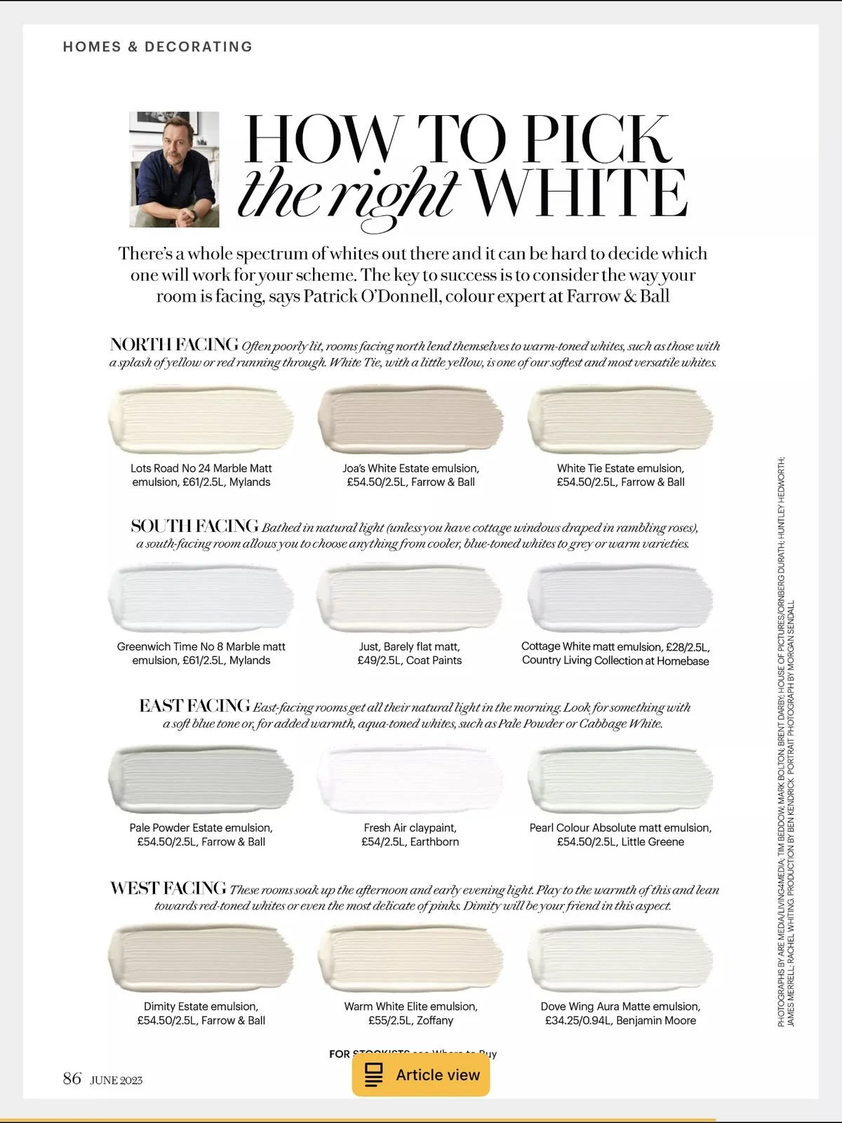
Consider your lighting. If your room is flooded with natural light, you'll see the hue's truest color. Other lighting types/sources (fluorescent, for example) can draw out the warmer or cooler tones in a color.
Try samples on your wall. It's takes a little extra time and effort up front, but painting 3x3 "swatches" on your wall will give you a much better idea of which color you're drawn to, which looks best with your existing furnishings, and which looks best in your room's lighting.
COORDINATING TRIM + CEILING COLORS
Select a trim color that provides contrast from the walls, but that maintains a similar undertone. For example, if you have a cool gray wall, ensure your white trim does not have a creamy yellow undertone. A "blue white" will be better suited. For ceilings, try the same color you used on your walls or trim in eggshell sheen.


