The Best: White Paint Colors
Everything you need to know about selecting the right color and my go-to faves.
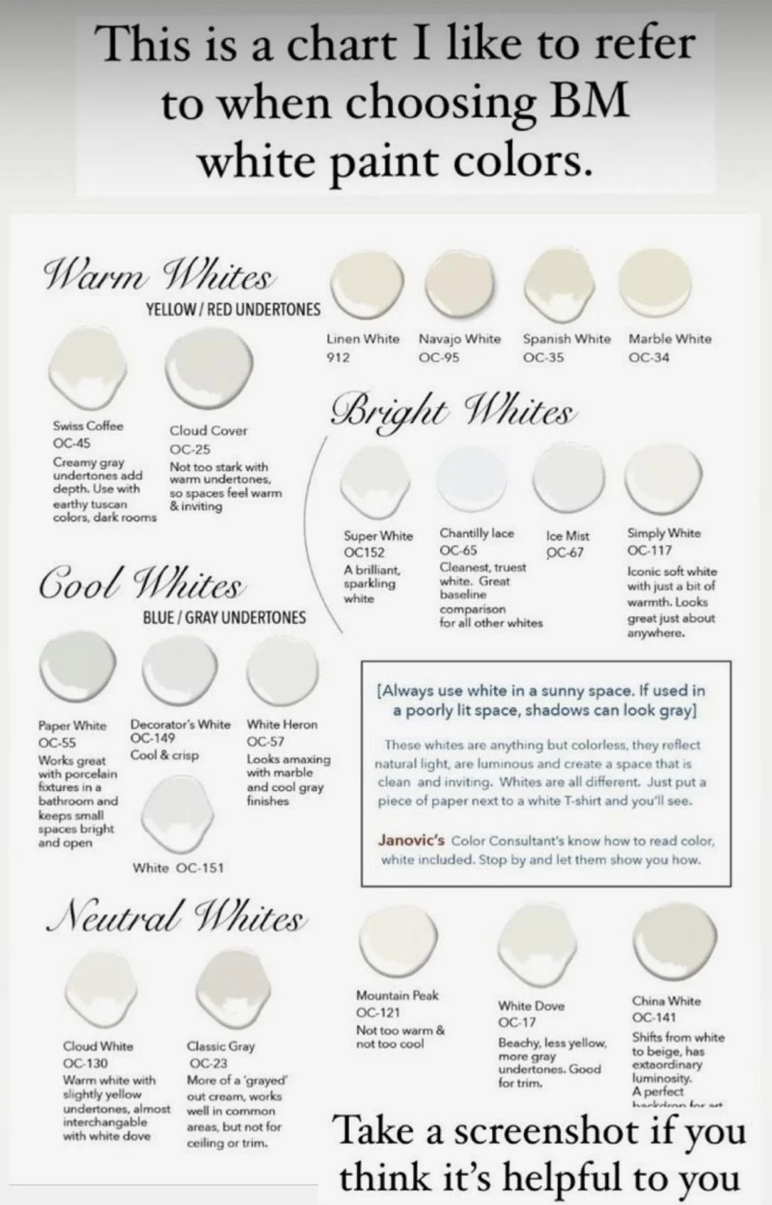
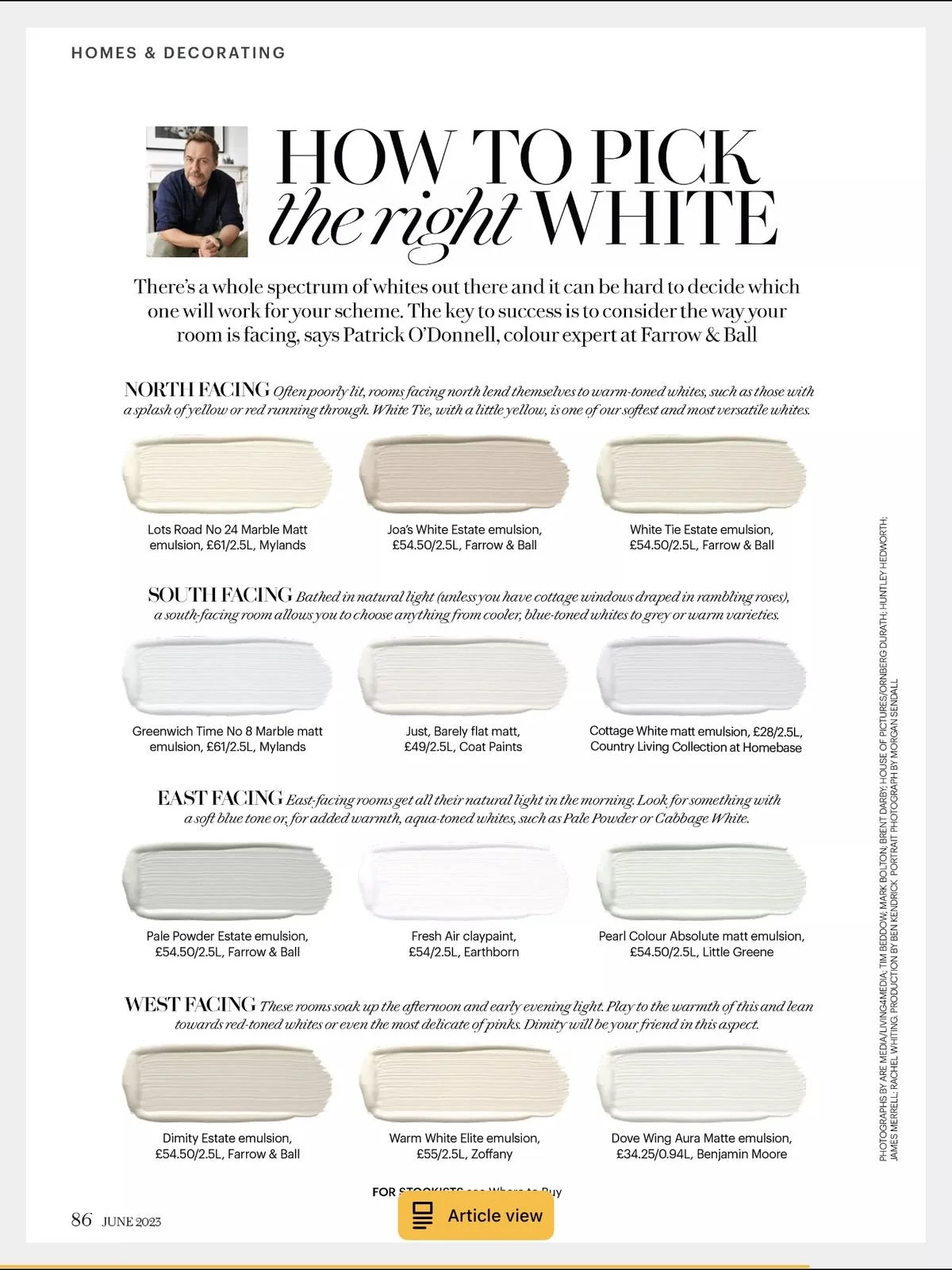
It is the design question every client asks, the decision that stumps the most: what paint color should I use? There are literally thousands of colors available - many of which are lovely and many more that look the same. (How many whites does this world need?!) Add in a dozen brands to choose from, a mind-boggling array of sheens... And while many designers and contractors will tell you otherwise, paint is a pain to change and it can be expensive to do so. Better to get it right the first time.
We'll share a little secret with you: designers use the same handful of colors over and over again. We know what works and rarely deviate. We not only want to get it right the first time, we want to get it right every time, because wall color is so important.
NEUTRALS RULE
Think of your walls like the canvas for everything else in your room. Neutrals don't go out of style or beg to be changed with the season. Regardless of whether you love brights, deep hues or anything in between, choosing the right neutral will provide your color palate with a strong foundation, allowing your furnishings, window coverings and architectural details to really pop.
OUR FAVORITES
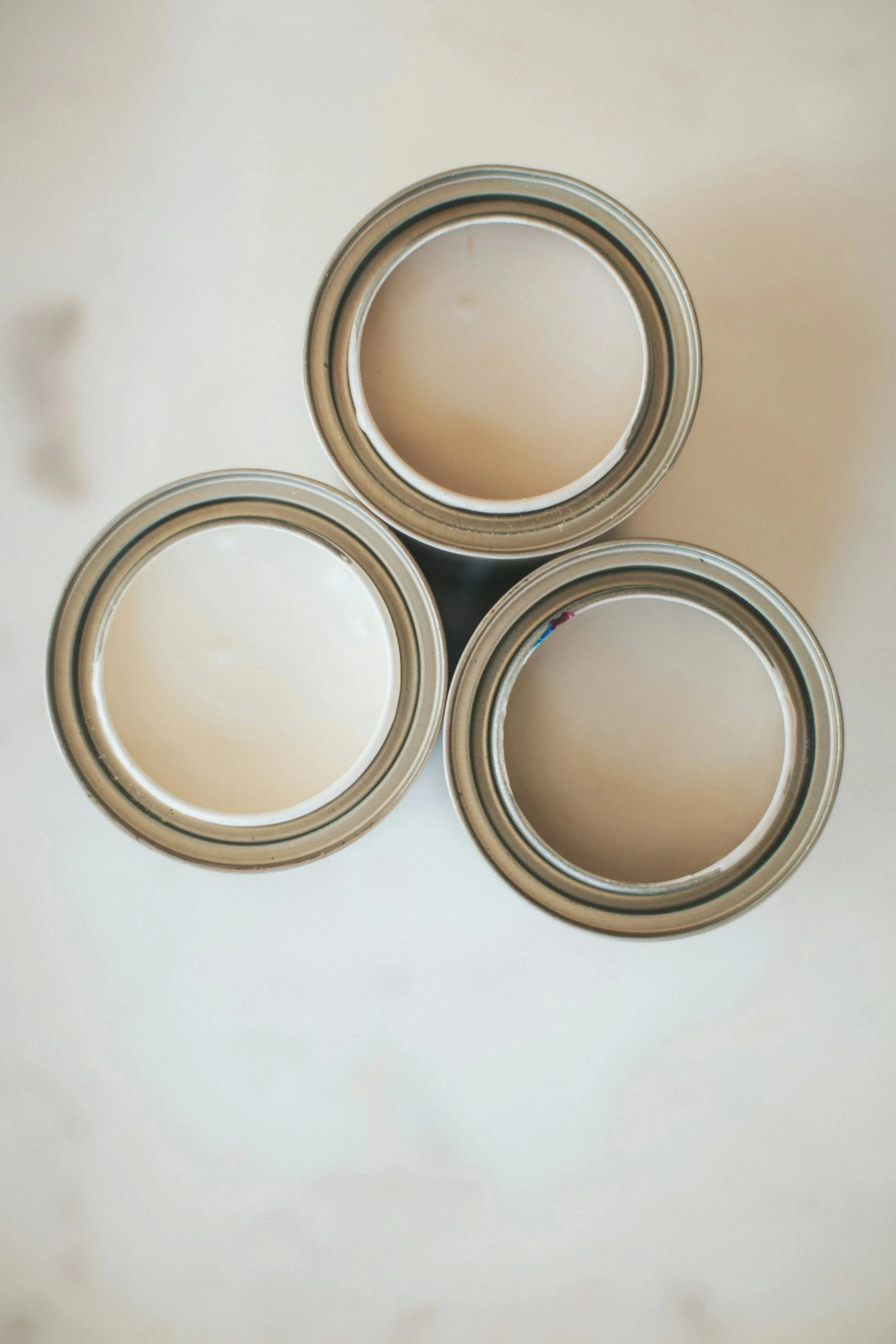
Before you judge: the colors above look nothing like they do in real life, so we're doubtful you'll fall immediately in love with them like we know you would if you saw them in person. Ugh. We beg you to head to your local Benjamin Moore retailer and see their beauty in person... they're worth it.
Our go-to color for trim is Benjamin Moore's Simply White, OC-24. It's not too cool, not too warm... it's simply white. And for a soft, creamy, "I play well with others" wall color, we use Benjamin Moore's Wind's Breath, OC-117. It's not too cool or warm. It doesn't push yellow or gray (as many neutrals do!), but it looks beautiful with either. It's the perfect neutral.
The combination is admittedly light, which we love, because it creates an airy foundation... to which you can add everything from bright hues to deep tones, depending on your style or mood. There is enough contrast from trim to wall, but not so much that all you see is woodwork. We've used it countless times because it works.

Simply White, OC-117, Benjamin Moore

Winds Breath, OC-24, Benjamin Moore
CHOOSING THE RIGHT COLORS
If you don't care for the above combo, here's how to select your own:
Look for inspiration. There are many resources (Instagram and Pinterest are our faves) where you can find photos with paint colors listed. Select your top three and look for the common thread - are they all cool? All creamy? Somewhere in between?
Look at your existing furnishings. If you're in love with gray walls, but have all gold-yellow-cream upholstered furniture, it may be wise to compromise with your paint color. (Mixing neutrals is very "in" but tough to do well.) Consider a hue that can swing both ways, like Feather Down (above).
Pay attention to undertones. This can be tough to identify in a light shade, so look at the darkest color on the swatch (within the same color family) for clues. Do you see cooler tones like blue or green? Or warmer tones like brown or yellow?
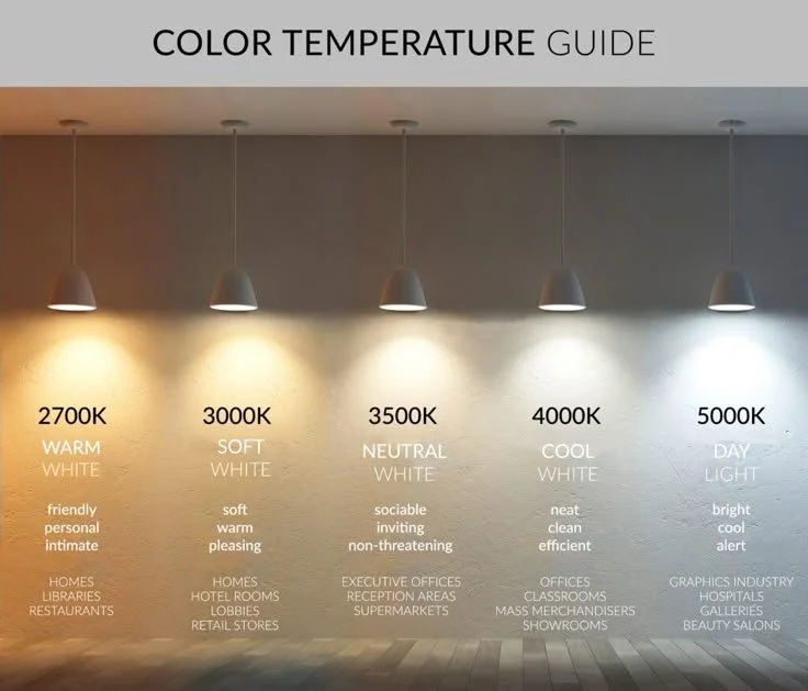
Consider your lighting. If your room is flooded with natural light, you'll see the hue's truest color. Other lighting types/sources (fluorescent, for example) can draw out the warmer or cooler tones in a color.
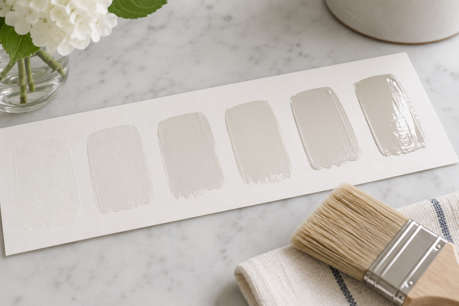
Try samples on your wall. It's takes a little extra time and effort up front, but painting 3x3 "swatches" on your wall will give you a much better idea of which color you're drawn to, which looks best with your existing furnishings, and which looks best in your room's lighting.
COORDINATING TRIM + CEILING COLORS
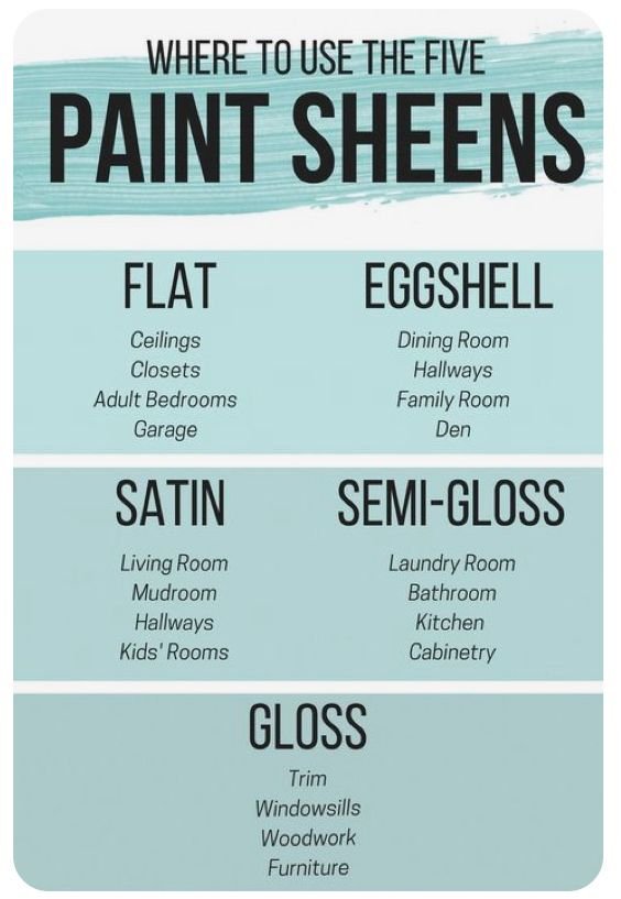
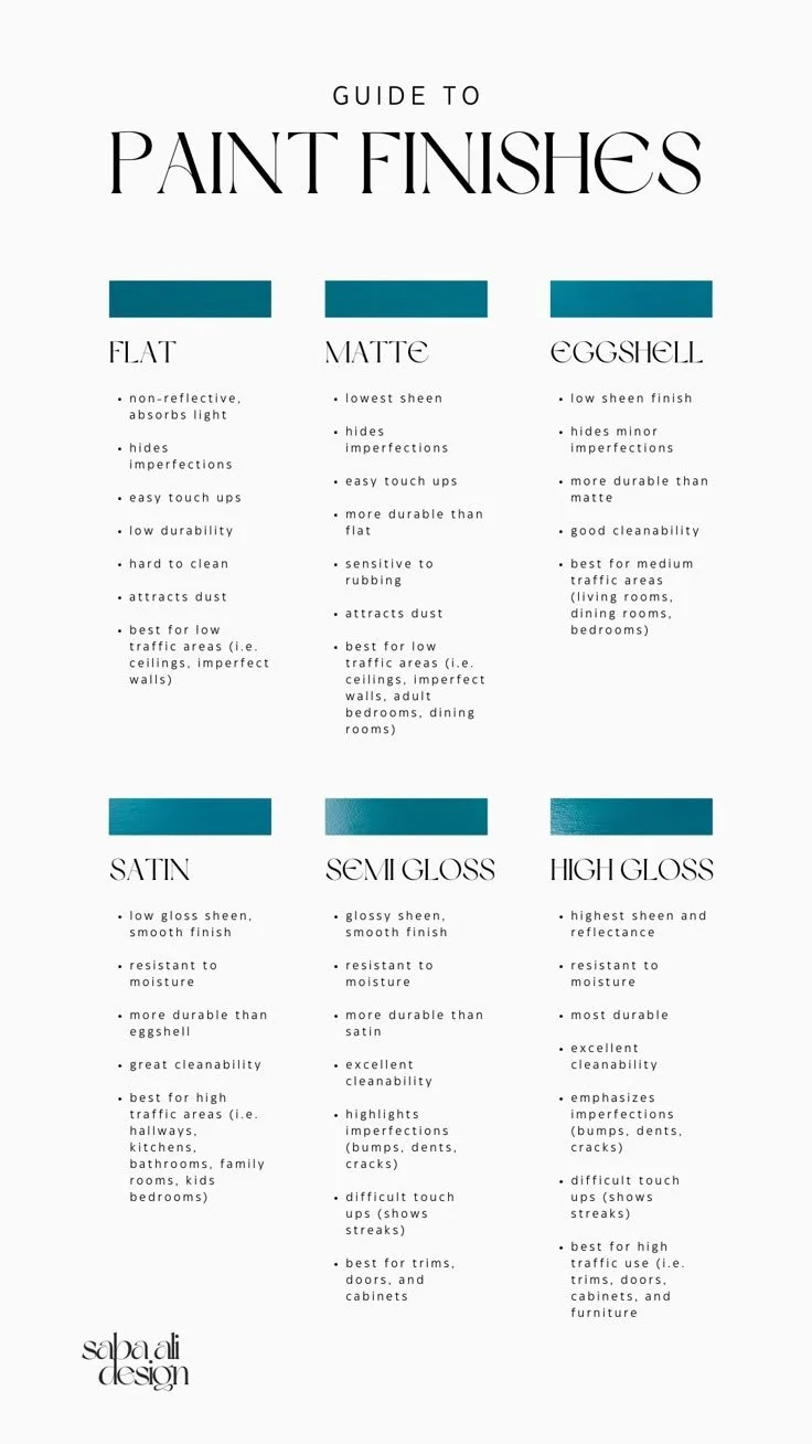
Select a trim color that provides contrast from the walls, but that maintains a similar undertone. For example, if you have a cool gray wall, ensure your white trim does not have a creamy yellow undertone. A "blue white" will be better suited. For ceilings, try the same color you used on your walls or trim in eggshell sheen.

Key Design Concepts
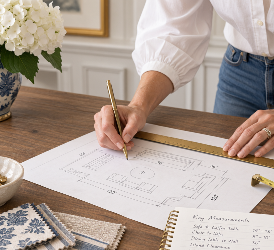
1) Who is this homeowner, and 2) How do they want to live? In other words: Who do you live with and how do you all spend your time? How much space do you have and how does it make sense to allocate that space based on your lifestyle?
https://www.chairish.com/blog/rita-konigs-rules-of-decorating/?guid=zl1ary
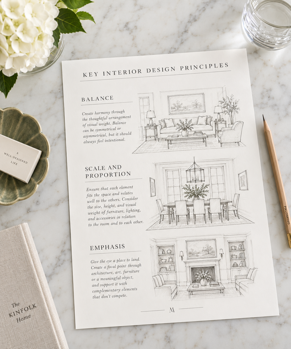
The core principles of interior design are guidelines for creating beautiful, functional spaces, commonly listed as Balance, Harmony/Unity, Rhythm, Emphasis, Proportion & Scale, Contrast, and Details. These principles help arrange elements like color, texture, and furniture to achieve visual stability, flow, and interest, ensuring the room feels cohesive, serves its purpose, and reflects personality.
The 7 Key Principles:
Balance: Achieves visual stability, either symmetrically (mirror images) or asymmetrically (different objects with equal visual weight).
Harmony/Unity: Creates a sense of belonging, making all elements feel connected and cohesive through consistent style, color, or texture.
Rhythm: Guides the eye through a space using repetition, pattern, or color, creating flow and movement.
Emphasis: Establishes a focal point, drawing attention to a key feature like a statement piece or accent wall.
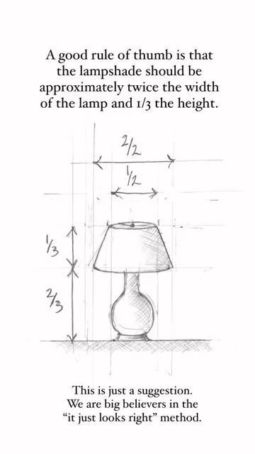
Proportion & Scale: Relates the size of objects to each other and to the room, preventing items from looking too large or too small.
Contrast: Adds visual interest by pairing opposing elements, such as dark with light, or rough with smooth textures.
Details: The finishing touches—accessories, hardware, and decor—that complete the space and add personality.
How They Work Together:
These principles, combined with design elements (like color, line, texture, form, light, and pattern), provide a framework for designers to create spaces that are both functional and aesthetically pleasing.
Applying them results in interiors that feel intentional, peaceful, and well-put-together, regardless of individual style